-
Jan 30, 2023, 11:08 am4.8k ptsInsanely Great Special Content
Designing a contact form is essential for many websites if they want to interact with potential customers. A contact form with a poor design may become ignored soon. Your audience may be drawn in and your conversion rate can be raised with an effective contact form.
The conversion rate of the form is impacted by many variables. While we could just tweak our contact forms until we find a design we like, the best method to increase their conversion rate is to base them on tested research. We'll examine research-based advice and сontact form examples to increase form conversions in this article.
1. Use a well-designed layout
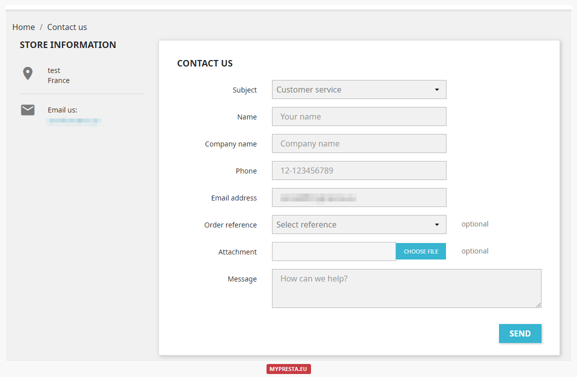
This contact form needs to look good and feel comfortable. This concerns the fields' position and size. Field labels need to be placed above them and should be simple to read. The form needs to appear friendly and be simple to use. The size of the fields should correspond to the anticipated length of the response, according to earlier research that Google sponsored.
2. Limit the number of form fields
People may become discouraged if there are too many fields to choose from. The form will be easier to fill out and less intimidating for the user if fewer fields are necessary. According to the QuickSprout research, a form with just three fields had a 25% discussion rate. With up to five fields, this proportion dropped to 20%, and with more than six fields, it dropped to 15%.
Make sure you have the proper tab order and don't have more than five fields. A conversational interface that leads users through the survey one question at a time should also be taken into consideration. This lessens interruptions and limits the number of form fields on each page so that visitors won't feel overwhelmed. A form that just includes one or two fields can be appropriate for use as an inline form.
3. Determine the best form placement
Make sure to include your contact forms on various pages and at various places. According to studies, your main call to action should be displayed above the fold. This space should be uncluttered and uncomplicated. The form won't be noticed if it is crowded.
Eliminating clutter and distractions is easy with a landing page that has a straightforward form. Additionally, it will keep the form open and visible on screens of any size.
According to Clicktale, the recommended distance from the top of the page is no less than 800 pixels. They also demonstrate scrolling on 76% of the test websites. The material is visible to those who are prepared to scroll.
4. Optimize the form for mobile

About 58% of website visits in the US in 2018 were made on mobile devices, according to a report by PerficientDigital. Therefore, it makes sense to make the contact form mobile-friendly. Due to the restricted area available, optimizing for mobile enables you to remove unnecessary fields, creating a cleaner design.
5. Use the right color for the button
No single hue works best in all circumstances, but there may be one that works best for your demographic. This is true for all calls to action and also applies to the contact form's submit button. According to Hubspot's A/B test, a red CTA button performed 21% better than a green one. OptinMonster demonstrates that when selecting colors for CTAs and their backdrop color, color psychology should be used.
6. Don't ask for the personal information you don't need
People often dislike sharing personal information like their addresses and phone numbers. This may lead to a significant amount of abandonment. According to KoMarketing, the number one item that customers prefer not to give on a form is their phone number (58%). Due to the increase in spam calls, this is much more true today. Next, at 53%, was a home address. So, use conditional logic to create more intelligent forms to ask for data that you only need.
7. Don't use CAPTCHA
CAPTCHA is excellent for minimizing spam, but it also lowers the number of lead form submissions. The impact of CAPTCHA on conversion rates has been studied by Moz. Spam was cut by 88% over the three-month test period, while the failure conversion rate was 7.3%.
Images and text may be hard to read, and many users may find it tedious to execute math operations or respond to queries. The reCAPTCHA that Formidable Forms utilizes is typically undetectable to website visitors.
8. Make the errors clear
Make sure the user can immediately identify the problem if they experience one by making it simple for them to do so. Stress can be a result of mistakes. They could move on if it proves to be too challenging to understand. Be certain that the issue is highlighted and that the message is close to the field.
Conclusion
These are our top 10 research-backed suggestions for improving contact form conversion rates. Any contact form's conversion rate may be significantly increased by streamlining it, making it simple to comprehend, not requesting too much information, making it appealing, and also simple to use.
The form has to be as streamlined as feasible if your organization depends on customers using it. The suggestions are simple to use and have a significant influence on your conversion rate.
Have you used these eight suggestions to increase the conversion rates of your Formidable Forms contact forms? In the comments below, tell us about your experience.
Trending Today on Tech News Tube


Follow all of the top tech sites in one place, on the web or your mobile device.